Remix prompt · SaaS
A ready-to-paste prompt that captures Orshot's layout, typography and signature moves for your product. Steal the craft, not the brand.
[YOUR PRODUCT], [WHAT IT DOES] and [WHO IT'S FOR] with yours.The prompt
Build a landing page for **[YOUR PRODUCT]**, [WHAT IT DOES, ONE LINE], for [WHO IT'S FOR].

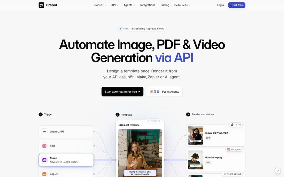
Design it in the style of **Orshot's homepage (orshot.com)**: borrow its structure, typography, rhythm and signature moves, but use my product, copy, logos and screenshots. Don't copy their text, logo or images.

**Feel:** clean, precise developer SaaS. The real product sits right under the headline so you get it in one glance. Light, airy and full of small, crisp UI. Credibility from real workflows, code and quotes.

**Type**
- Headlines: **Inter 600**, hero ~66px desktop / 38px mobile, line-height 1.02, tracking -0.034em, centred. One phrase in each big headline is set in **Literata italic** in a muted indigo (`#5B5BD6`), e.g. "Render from *any data source.* Deliver to *any destination.*".
- Body: **Inter** 15–16px, grey `#606060`.
- Quotes and testimonials: **Literata** 22–28px, ink `#030303`.
- Code: **Spline Sans Mono** 13px.

**Colour**
- Page `#FDFDFD`, cards `#FFFFFF`, soft panels `#F7F7F7`, hairline borders `#ECECEC`, ink `#030303`, grey text `#606060` / `#454545`.
- Art accents only inside cards: soft gradients mint→teal (`#CDE0AE`→`#5CD8D0`), peach→pink, lavender→blue. Never on text or backgrounds.
- Primary CTA: black `#030303` with off-white text, **8px radius**, 48px tall. Secondary: a white pill with tiny avatar icons ("For AI agents").

**Layout (content width 1080px)**
1. Nav: logo left, 6 small text links centred (some with ⌄), "Login" and a small black "Start free" button right.
2. Tiny announcement pill above the headline ("NEW · Introducing [feature] →").
3. Hero: two-line headline (one italic Literata phrase), a 2-line subhead, black CTA plus a secondary pill.
4. **Signature move:** directly under the hero, a **live workflow diagram**: 3–4 white node cards (Trigger → Template → Output) joined by thin curved connector lines with small status dots. The middle node shows a real product preview, and the outputs fan out on the right as thumbnails. Animate dots travelling along the connectors.
5. "Trusted by 160+ teams" plus a logo wall in a bordered 2×6 grid (grey logos).
6. Repeating feature blocks: a small coloured uppercase label pill ("AUTOMATE & DELIVER"), a headline with an italic Literata phrase, one line of copy, then a **bento grid** of bordered cards (12–16px radius) with mini UI previews, integration chips and code panels with file tabs.
7. Between feature blocks, a **big testimonial**: a large Literata quote (2–3 lines, left) with a quote mark, avatar, name and role, and a small "Join 160+ teams" plus black button on the right.
8. Feature grid: 3 columns of small bordered cards, each with a tiny line icon, a bold 14px title and 2 lines of grey copy.
9. Customer stories row (cards with avatar, quote, link), then a final CTA and a footer with link columns.

**Details:** everything hairline-bordered rather than shadowed; generous 96px section spacing; small text sizes (13–15px) in UI to make it feel like a real tool.

**Motion:** connector dots flowing in the diagram; cards fade up on scroll; the code panel types once.

**Avoid:** dark mode, glassmorphism, purple hero gradients, emoji icons, vague "AI-powered" copy. Show the actual product.

Responsive: the diagram becomes a vertical flow on mobile; bento stacks to one column.
Tested
We pasted it into a fresh Claude for a made-up product, Shipshot, an API that turns database rows into PDF invoices, and got this back first time. No edits.

Redesign service
A new hero for £99, or the whole homepage for £299.
See the service Stunning.design