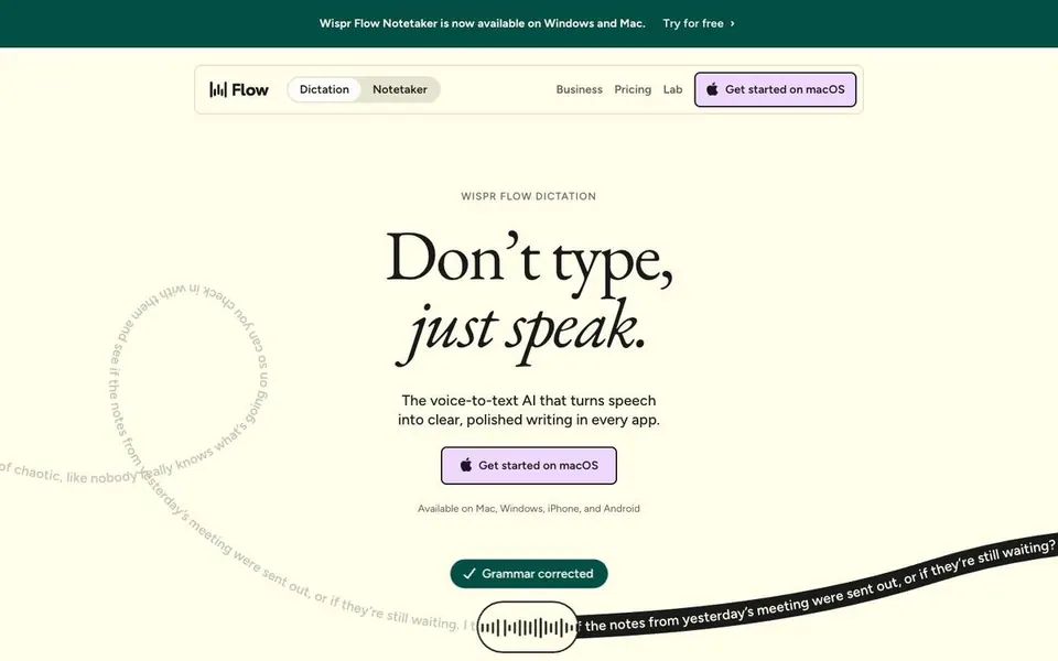
Remix prompt · AI · Mac apps
A ready-to-paste prompt that captures Wispr Flow's layout, typography and signature moves for your product. Steal the craft, not the brand.
[YOUR PRODUCT], [WHAT IT DOES] and [WHO IT'S FOR] with yours.The prompt
Build a landing page for **[YOUR PRODUCT]**, [WHAT IT DOES, ONE LINE], for [WHO IT'S FOR].

Design it in the style of **Wispr Flow's homepage (wisprflow.ai)**: borrow its structure, typography, rhythm and signature moves, but use my product, copy, logo and screenshots. Don't copy their text, logo, images or illustrations.

**Feel:** warm, literary and calm. An AI product that feels like a beautifully set book, not a tech demo. Lots of air, centred hero, big rounded "slabs" of colour stacked down the page.

**Type**
- Headlines: **EB Garamond**, regular 400, very large (hero ~96px desktop / 48px mobile), line-height 0.95, tracking -0.03em. Set the **second line in italic** ("Don't type, / *just speak.*" pattern). Section headlines mix roman and italic words in the same line ("Built around *how you work*, not how we think you should.").
- Body and UI: **Figtree**, 14–18px, line-height 1.3–1.5.
- Eyebrows: Figtree 12px, uppercase, tracking +0.12em, muted.

**Colour**
- Page: warm cream `#FFFFEB`. Ink: `#1A1A1A`. Muted text `#373734`.
- Deep green `#034F46` for the announcement bar and one full section.
- Near-black `#1A1A1A` for the logo-wall and testimonial sections.
- Beige cards `#E4E4D0`. Lavender CTA `#F0D7FF` with a 1.5px ink border. Orange `#FFA946` as a rare pop.

**Layout, top to bottom**
1. Thin deep-green announcement bar, cream text, centred, with a "Try for free ›" link.
2. Nav inside a floating, rounded, hairline-bordered container: logo left, a **segmented pill toggle** of two product modes, plain text links, and a lavender bordered CTA with a small icon.
3. Hero, centred: small uppercase eyebrow → huge Garamond headline (line 2 italic) → one-sentence Figtree subhead → lavender CTA (8px radius, 52px tall) → tiny "Available on …" line.
4. **Signature move:** a long sentence set on a curving text path that loops across the hero. On the left it's grey and messy (the "before"). It passes through a pill-shaped capsule in the centre (a waveform or your product's icon), and comes out the other side as crisp text on a black ribbon (the "after"). Animate the text slowly along the path. Adapt the before/after to what your product transforms.
5. Near-black rounded slab: "Used by professionals at" plus a logo marquee in white.
6. Deep-green rounded slab: a big centred Garamond claim with an italic half ("4x faster *than typing*" pattern), then a comparison of two cards side by side (old way vs your way, with a big number in each).
7. Cream sections: a centred two-line Garamond headline, then alternating feature rows, each with a small beige UI card (16px radius) showing the product doing the thing, and a short Garamond subheading plus 2 lines of Figtree.
8. Beige trust card: Garamond headline left ("Your data *stays yours.*" pattern), copy middle, three circular outline badges right.
9. Near-black slab: "From the first *people to use it.*" Testimonials as tilted colourful sticky notes (orange, lavender, green).
10. Final cream CTA and a simple footer.

**Details**
- Sections are big slabs with 32px rounded corners that slightly overlap the section above.
- Hairline borders `1px rgba(26,26,26,.12)`. Generous padding (120px+ between sections on desktop).

**Motion:** text-path ribbon drifting slowly; logo marquee scrolling; feature cards fading up gently on scroll. Nothing bouncy.

**Avoid:** purple-blue gradients, glassmorphism, emoji feature icons, generic three-card grids, "Unlock the power of" copy.

Responsive: stack everything to one column under 768px. Keep the headline italic on mobile.
Tested
We pasted it into a fresh Claude for a made-up product, Tidy, an AI that turns messy inbox threads into one clear paragraph, and got this back first time. No edits.

Redesign service
A new hero for £99, or the whole homepage for £299.
See the service Stunning.design